Apple Agent Toolbox Re-Build.
Team: Designit North America
Client: Apple
Role: Senior UI/Visual Designer
Project Description: Re-design Apple’s internal application to process orders and returns. Our team consisted of a highly collaborative effort between project manager, UX lead, Creative Director, and Visual Designer. We focused first on the user flow for item cancellations, knowing that this is a common action that agents need to perform on a regular basis. The extended flow will be based on the selected experience direction from our approaches.
Challenges:
Overwhelming and unrestrained display of information and options.
Less than intuitive and difficult to easily find information, determining actions, and navigating through experience
Ineffective use of space, with unused real estate. Small side panes, and always visible icons / confusing buttons.
Original experience:
Original experience was overwhelming, less than intuitive, and had an ineffective use of space. Based on learning conducted by stakeholder workshops we explored the challenges and opportunities for improvement of the overall experience.
Inspiration // Tool Exploration
We sought out inspiration through other interfaces such as Magento, Shopify, and Salesforce. We noticed common successes and failures within each to inform our conversation with stakeholders.

Example wireframes
Based on research and exploration by our UX lead, we were able to solidify approved wireframe experiences that simplified menus, icons, order details and alerts.
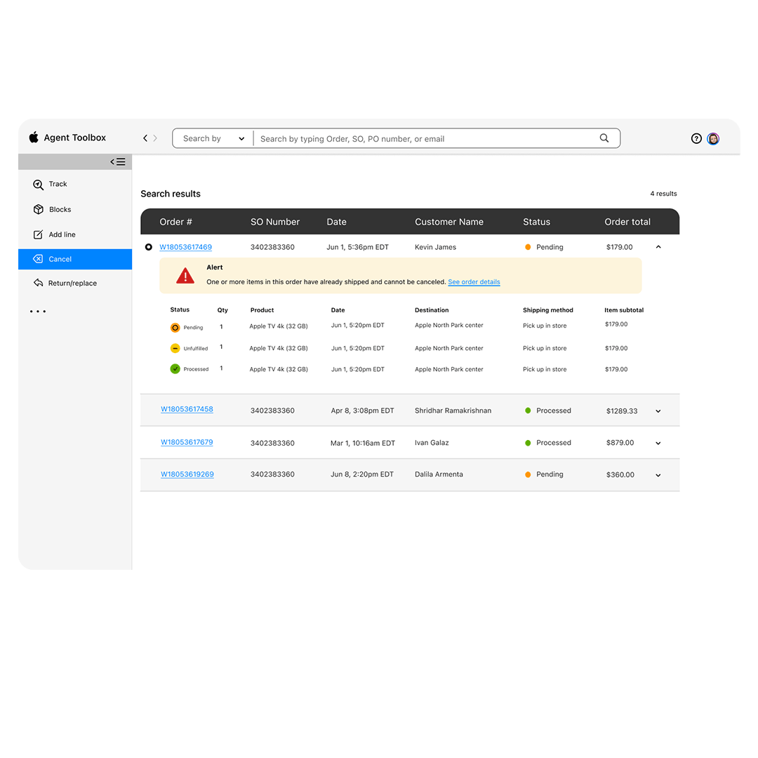
Menu(s)
We built our final design around the expanded side-bar menu. We updated icons to clearly represent the task. The side bar will be included in each step of the experience without impeding on the workflow. Giving the user the option to expand and collapse to ensure even more space to process orders.

Visual Design Overview
The Apple brand is clean and unobtrusive. Using Apple design systems, we built a custom experience originally in light mode with hints of color to be 100% purposeful. When the user logs in, they will be prompted and welcomed back to begin their high level search. We use primary blue to guide the journey through clear actionable items. Statuses are defined by shades of orange, yellow, and green.

Accessibility
Each screen was designed with light and dark mode viewing options.